Introduction
In today’s digital landscape, visual content plays a crucial role in capturing and retaining an audience’s attention. Whether you’re a tech blogger, YouTuber, or content creator, your banner is often the first thing people see when they visit your website or social media profile. A well-designed banner can convey your brand’s identity, make a strong first impression, and effectively communicate the essence of your content. This article will guide you through the essential strategies and best practices for designing an eye-catching tech tips banner that resonates with your audience and elevates your brand.
Understanding the Purpose of a Tech Tips Banner
Before diving into design tips, it’s important to understand the purpose of your banner. For a tech-focused platform, the banner serves multiple roles:
- Brand Identity: It should reflect the unique style and personality of your tech tips brand, whether that’s sleek and modern, bold and innovative, or friendly and approachable.
- Content Preview: Your banner should give visitors a quick insight into what kind of tech tips or content they can expect—be it gadget reviews, software tutorials, or industry news.
- Engagement Driver: A visually appealing banner encourages visitors to explore your content further, increasing engagement and interaction with your platform.
Key Elements of a Tech Tips Banner
A successful banner design incorporates several key elements that work together to create a cohesive and attractive visual.
1. Brand Logo and Name
Your logo is a cornerstone of your brand identity. It should be prominently displayed on your banner to reinforce brand recognition. Pair it with your brand name in a clear, readable font that aligns with your overall aesthetic. For tech brands, a modern, sans-serif font often works well, conveying a sense of innovation and forward-thinking.
2. Tagline or Slogan
If your tech tips brand has a tagline or slogan, incorporating it into your banner can add depth to your messaging. Keep it short and impactful. For instance, a tagline like “Simplifying Tech for Everyone” or “Your Go-To Source for Tech Insights” quickly communicates the value you offer.
3. Visuals and Imagery
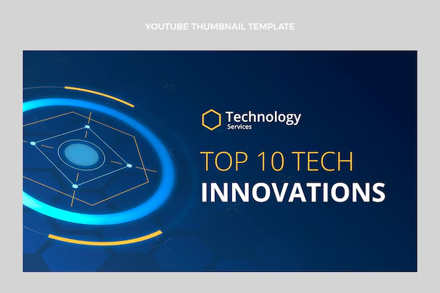
The imagery you choose should resonate with your tech-focused content. High-quality images of gadgets, coding graphics, or abstract tech-related designs can be effective. However, avoid cluttering your banner with too many visuals. Instead, opt for one or two striking images that align with your brand’s theme.
4. Color Scheme
Color plays a critical role in setting the tone of your banner. For a tech brand, colors like blue, gray, black, and white are often used because they convey professionalism, trust, and modernity. However, incorporating a pop of color—such as neon accents—can make your banner stand out and add a dynamic element.
5. Typography
Typography should be clean and easy to read, even at a glance. For tech brands, bold and futuristic fonts can work well, but balance is key. Your text should be legible and not overpower the other elements of the banner. Consider using different weights or styles (e.g., bold for the headline, regular for the tagline) to create visual hierarchy.
Best Practices for Banner Design
Now that you have a grasp of the key elements, let’s explore some best practices that can help you create an effective tech tips banner.
1. Keep It Simple and Focused
A cluttered banner can overwhelm visitors and detract from your message. Stick to the essential elements—logo, name, tagline, and one strong visual. This minimalist approach ensures your banner is clear, focused, and impactful.
2. Use High-Resolution Images
Nothing undermines a banner more than pixelated or low-quality images. Ensure all visuals are high-resolution and properly scaled to maintain a professional look. This is particularly important as banners often span the width of a screen, making any flaws in image quality glaringly obvious.
3. Optimize for Different Platforms
Your banner should look great across all devices—desktops, tablets, and smartphones. This means designing with responsiveness in mind. Avoid text or important elements too close to the edges, as they might get cropped on smaller screens. It’s also wise to test your banner on different devices to ensure consistency.
4. Balance Text and Visuals
While visuals are important, your text—especially your brand name and tagline—should be easily readable. Maintain a good balance between text and imagery, ensuring that neither element overpowers the other. Using contrasting colors for text and background can enhance readability.
5. Update Your Banner Regularly
Your tech tips banner isn’t set in stone. As your brand evolves, so should your banner. Regular updates keep your content fresh and relevant, and can reflect any new directions or focuses in your tech tips offerings. Seasonal updates or changes to coincide with major product launches or tech events can also be engaging for your audience.
Conclusion
Your tech tips banner is more than just a visual placeholder—it’s a critical component of your brand’s identity and a powerful tool for engaging your audience. By focusing on key elements like your logo, color scheme, and typography, and adhering to best practices like simplicity, high-quality imagery, and responsiveness, you can create a banner that not only captures attention but also reinforces your brand’s message. In the fast-paced world of tech, a well-designed banner can set you apart, making your content more inviting and memorable for your audience.


